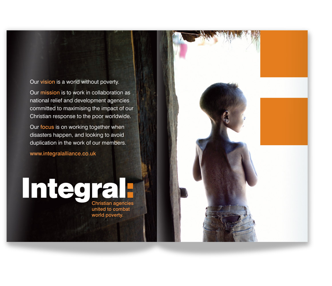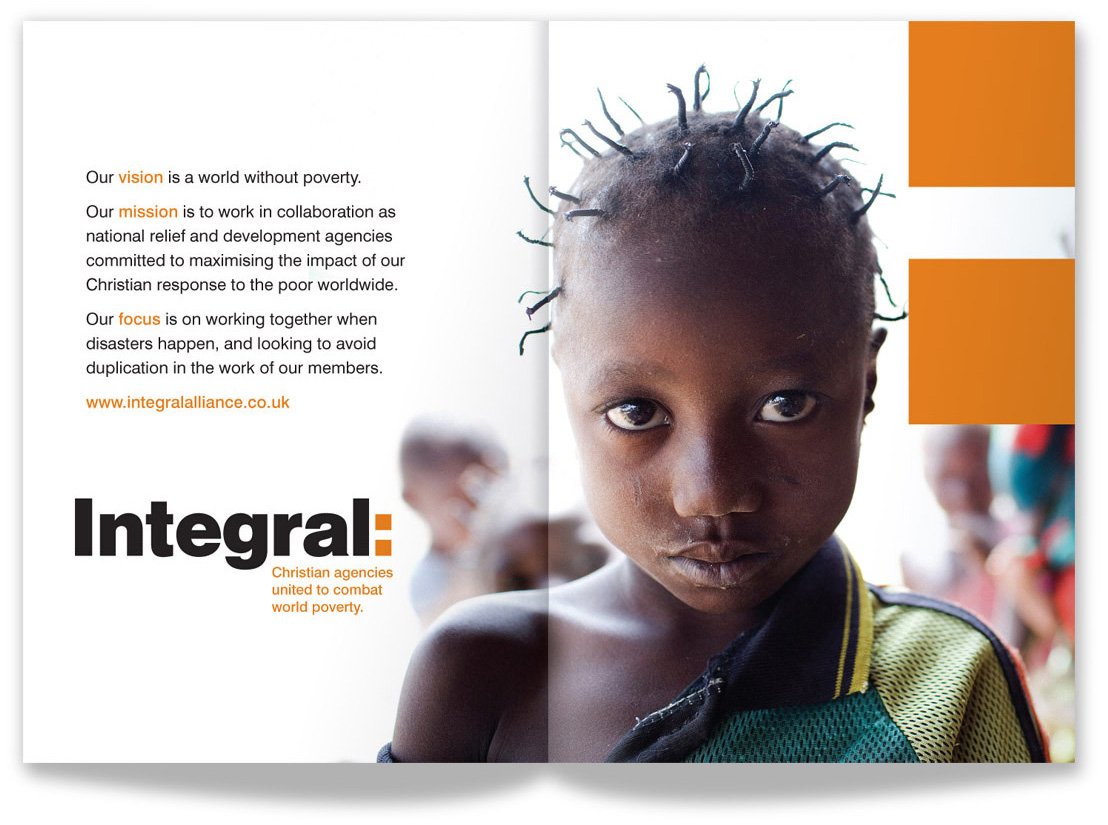
Integral is a charitable organisation uniting 23 international relief and development agencies for the greater effectiveness and impact of the work they undertake through more than 600 partner groups in 85 countries.
There have been a number of occasions where we have been brought in to help resolve a struggling design process - this is one such project from 2004. Prior to our involvement, months of insightful research and development work had been done, but with no final agreement being reached among the many international stakeholders on visual representation, or even on what the organisation would be called, we were invited to contribute fresh strategic and creative direction to this vast project.
Eventually, we presented our thinking to the decision making panel in Torronto where our solution received unanimous approval. Their response speaks for itself:
'The bold simplicity of the logo attracted all of us. Although one might be tempted to say it is too simple, we reviewed its application on stationery and other printed material, advertising and even vehicles, and were quite struck by the presentation. Over the course of all of our review and experimentation we looked at so many interesting ideas but almost every symbol required explanation or didn't quite fit the idea. This logo simply says, 'Integral: a bold idea that is the sum of what follows.' The fact that the logo so simply but emphatically states the purpose pictorially without a symbol that requires explanation is really remarkable.'
Read more about this project >
Researching the outcomes of the stalled process, we assessed what was relevant to our own understanding of what was required and how much of that could be taken forward and explored further.
Other aspects around which no agreement had so far been reached, perhaps understandibly with so many interested parties, were the issues of a strapline to support the brand, and an appropriate graphic language.
As a Christian organisation, it had previously seemed natural and appropriate that a cross would form part of the brand identity. However, it was also clear that in some of the territories in which the partner organisations were working, a Christian cross could be seen as at best insensitive and at worst antagonistic, therefore hindering the effectiveness of the work it aimed to do - perhaps even preventing access to some territories at all.
Various other ideas for motifs had been proposed but none had convinced the decision making team.
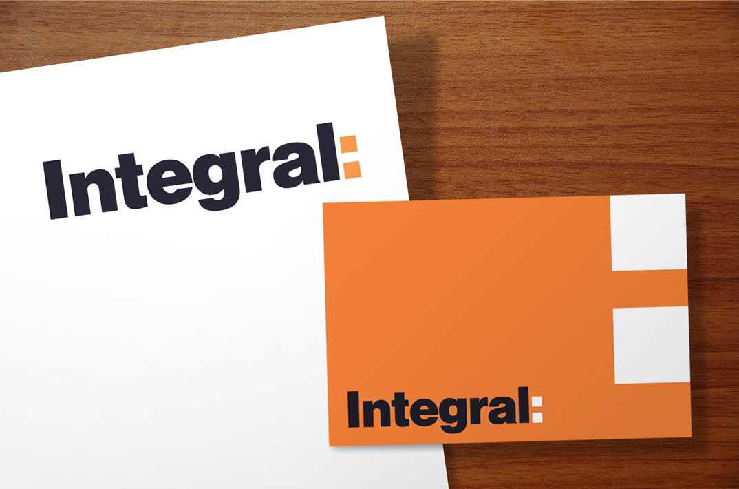
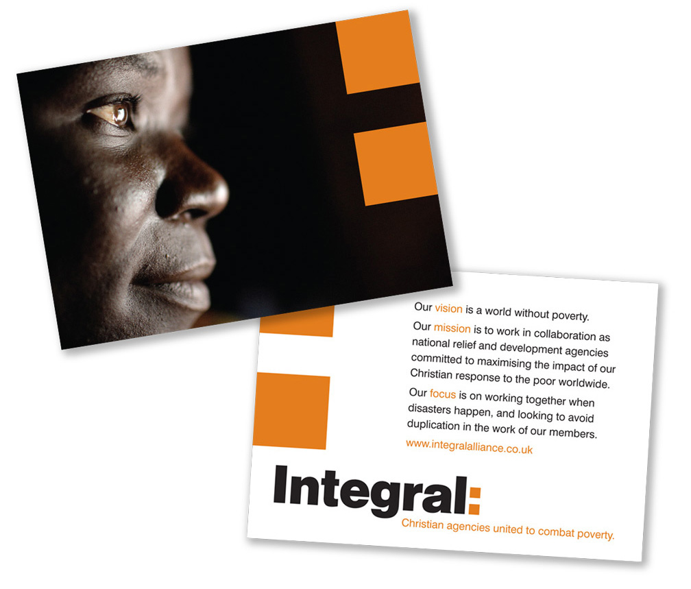
In our visual development we explored solid letterforms that would enable the word 'Integral' to become its own marque with a serious and foundational form. Yet, while certain we were correct in this approach, we still felt we needed a very simple way of communicating ideas of the organisation's purpose and forward progression without detracting from this rationale. Hence the introduction of the colon whose function was to convey Integral as 'having its purpose in what follows'.
The colon would then become a bold, graphic device in the implementation of the brand across various contexts and media in such a way that it would also hint at the Christian cross without overtly becoming one.